Case Study

Our team worked with keepsake preservation startup Virtual Time Capsule to grow user adoption.
We found that users feel like they were running out of time to capture the lives and memories of their loved ones as they got older or age out of life stages, but they struggled to intentionally capture the everyday moments and were afraid of botching the topic with their loved ones.
We defined a target market for Virtual Time Capsule's team to focus on, designs for their MVP, and the foundation to scale it.
We gave their users a tool to guide them through the process of capturing the memories that they will treasure most and a vehicle to share those memories as a way to connect with their loved ones over their shared experiences, improving user satisfaction rate by 46%.
Virtual Time Capsule's founding was inspired by loss. After suddenly losing his grandfather, Founder Rob Glaser wanted to help others capture the memories he wished he had.
Though the team felt that their product could serve anyone, Virtual Time Capsule was left with little concrete idea of who they should target first.
Our task was to:
Define their first target market
Create a user flow tailored to that user
Give them a foundation to continue to build the product on

We instead focused on a larger population of people who cared deeply about preserving memories. We sent out a survey to understand how people captured, stored, and revisited their memories and interviewed 9 potential users from both the survey and our network.
Our goal was to test our assumption that people wanted to capture their loved ones lives and to understand where they currently saw friction in the process.
Captured moments as they happened and curated later.
Participants didn't have a plan for what they wanted to capture, but curating the experience to share was critical.
Used memories as a way to connect with loved ones.
Whether it was to help others feel involved in their lives or to relive experiences together - participants used the act of revisiting their memories to connect.
They had specific moments they wish they had captured.
Every participant wished they had captured more and had specific moments that they wished they had saved.

Sarah
"I want my kids to know my parents, even if they never get the chance to meet them."
We created Sarah, the Anderson family historian.
Sarah's having a hard time watching her parents get older and she can't help but think of the long term - knowing that one day she won't be able to ask them to repeat one of their oft-retold stories.
She's terrified that one day she'll forget the sound of her father's voice or her mom's laugh and she wants to ensure that she can pass down a piece of them to the next generation.
Sarah can't see herself using VTC.
Usability testing found that users struggled to see how the current product aligned with their goals to capture their loved ones' stories and connect over shared experiences.


Sarah hears about Virtual Time Capsule from a friend and decides to investigate.

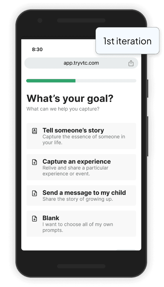
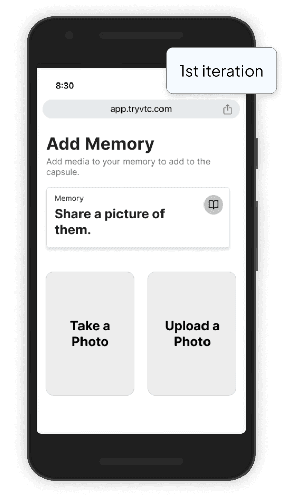
Uploading a video
She first clicks "Upload a Video", but she realizes she doesn't have any saved to her computer. She could transfer one from her phone, but she's more likely to go back and select record instead.

After selecting record, she must select a prompt. She looks them over and realizes that none of them are quite the right fit for what she wants to do.

She selects a random prompt and records a test video, scheduling to receive it later. She logs off and tells herself that maybe she'll come back to the site later to try again - but she's unlikely to.
Social media
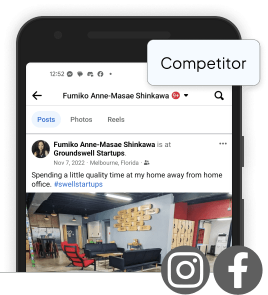
Tools like Facebook and Instagram enable users to scroll through a timeline of their memories, but users are less likely to dig deep and share really personal memories in a public forum.

Niche memory tools
There are some tools, like Ancestry's new Memory feature, specifically for curating memories to pass on, but they're public and heavily tied to their family tree features.
File storage
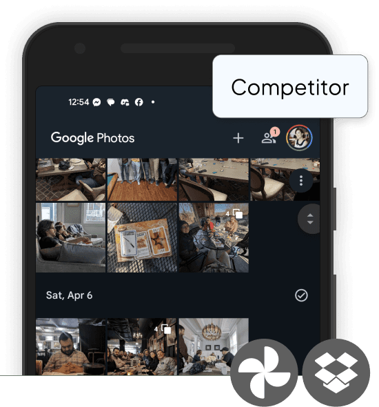
Storage solutions like Google Photos and Dropbox are reliable and secure, but offer no prompting and can bury more precious memories if used for other things.

Physical & hybrid options
Physical and hybrid options like scrapbooks or Storyworth can be expensive and time-consuming. They often put the work on loved ones - ultimately feeling like "homework."
So far, we'd been doing research in a vacuum to prevent bias, but it was time to get our team and the VTC team back on the same page.
I facilitated a design workshop with the client to present our findings and gain insight into how the VTC team has tackled the problem so far.
Key takeaways:
Our research resonated with what they knew on an anecdotal level.
They'd likely be open to our more novel solutions.
What's the worst possible solution to the problem?

Inspired by keepsake books and tools for wellness journaling, we took the most unique aspect of Virtual Time Capsule's product (scheduling memories to be sent ahead) and adapted it to better fit into the user's existing behavior and expectations, prioritizing connection and guidance.
To address user concerns about not knowing how to start or not capturing enough, we created a framework to guide users through prompts customized to their goals.
We introduced the ability for users to send prompts to their loved ones, making it easier to collaborate and create something that represents the whole family.

By framing the capsule as a gift, we were able to lessen concerns users had about storage and security on VTC's servers and gave them an incentive to get started.
During usability testing, the new designs saw a favorable overall response, with user satisfaction rating increasing from an average of 5.6 to 8, but there were still some issues to work out.
5/5 users misinterpreted the task of choosing a prompt.
4/5 users expressed that they'd want the choice to upload photos and audio files, not just videos.
5/5 users tried to add media to prompts from the Confirm Creation page.

On the original site, prompts were simply text fields that were selected once and never seen again.
By making them cards, I hoped that I could make them more recognizable and increase their visibility.

In the second iteration, I increased icon size to make it more readable and added additional icon types to help users know how they were intended to interact with prompts on different pages.
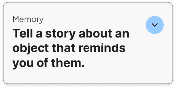
In the third iteration, I scaled back the range of icons to mitigate user confusion and added a "Memory" label to help users understand prompts' role in their capsules.

The initial design for adding a memory focused on making it actionable and ensuring that users had no question of where they were supposed to go. Because we wanted these frames to double as adding your own memory (rather than sending someone a prompt), we kept the copy vague.
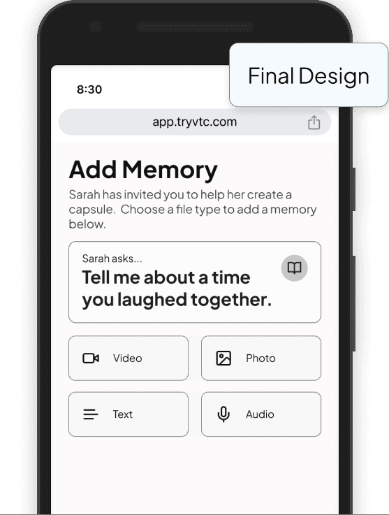
Realizing that users may not trust a site if they don't know exactly how they got there and what it's for, I focused on giving the user additional context - adding Sarah's capsule to the description and a "Sarah asks…" tag to replace the "Memory" label.

Virtual Time Capsule's original designs were using Material UI almost entirely as it came "out of the box." In conversations with the dev team, we found that they had been experimenting with the idea of moving to Tamagui, but weren't entirely sure what it would look like. The team would need a preview.
So I pivoted from our original designs in MUI to customizing the Tamagui design system to suit VTC's brand and product.
Inconsistent fonts and colors could be found throughout the original site and product.
In updating the style guide, we focused on accessibility, readability, and creating an environment where users felt supported and welcomed.
We swapped the primary blue for one more muted one that read less tech and more "retro" and changed all fonts to Plus Jakarta Sans for a more rounded look.


Create an onboarding flow to help users jump right in.
Usability testing of the new designs still showed us that users lacked confidence
I'd like to focus on how we might show users the value of Virtual Time Capsule's offering and help them become power users, faster.
Test and refine prompts to ensure we're meeting user goals.
During usability testing, we found that users were unsure which prompt to select.
I'd like to do more research into the target user's goals to ensure that we're building out the most needed and valuable Capsule templates first.