Case Study
Through user interviews and surveys, we found that DIY enthusiasts' main motivator is their budget. They need to ensure that they can complete their projects without blowing up their bank account or needing to hire someone to fix it.
We gave them easy access to the tools and knowledge they needed to tackle their home improvement projects with confidence, then we added support to help them overcome their projects' blockers wherever they arise, resulting in a 72% increase in task success.
Expand on Home Depot's DIY offering on its mobile app to increase app use and download rate.
Home Depot believes users are looking for ways to brainstorm, plan, track, and share their home improvement projects.

Cost-Conscious
They DIY out of necessity and prioritized cost over all else.
Visual Learners
They liked to be able to see the steps and the end result.
Values Expertise
They felt best when they had someone to ask for advice.

Rowan
"The only way I can afford the house I want is if I build it myself."
To err is human. Enter Rowan, our DIYer persona.
Rowan would represent the pressing need to DIY (cracked tile in their kitchen) and the high stakes that our users faced (what if a child or pet stepped on a piece of broken tile and was injured?)
Rowan needs to know, not think, they can handle the project and they need to know that their craftsmanship will hold up for years to come, especially while they focus on the other parts of their home that need attention.
"Maybe I should've just hired an expert."
Rowan's current DIY journey is fraught with uncertainty. They're concerned about wasting materials or resources and they're forced to make repeat trips to the store to buy additional or forgotten materials.


Rowan realizes that there's a crack in the tile in the kitchen.

They search for tutorials and resources to better understand what fixing it will involve.

They gather all of the materials and start the project.

During the project, they have to make 2-4 trips back to the store to buy additional materials or to replace ones broken accidentally.

Rowan finishes the project and is excited to enjoy their new flooring.

Two months later, the crack reappears due to an error in installation.
Unclear Menus
Menu options were different between the web, mobile, and app versions of the Home Depot DIY section.

Inaccurate Breadcrumbs
Breadcrumbs didn't match actual navigation - for example, users would access cleaning tips through "Moving".
Hidden Features
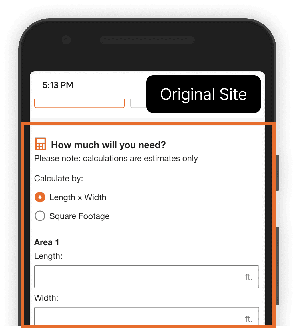
Home Depot's project calculators are a valuable tool for DIYers, but they could better direct users to purchase materials.
Broken Pages
Many pages of the DIY section redirected to the mobile site, where they loaded at an incompatible width, making them unusable.
In an unmoderated tree test, 16 participants were asked to find specific guides or to indicate where they might find DIY project resources. All users struggled to identify the correct location and only 10% (out of 48 total) of the tasks were completed correctly.
In our first designs of the solution, we targeted a mix of our highest impact and lowest effort solutions to see where we could create the greatest benefit for users at the lowest cost to the client.

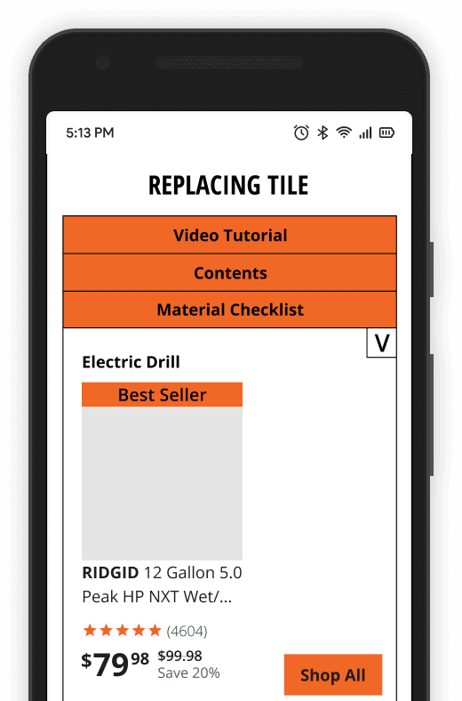

Originally planned as a banner to accompany tutorial steps and videos, we opted for a menu in the overview showcasing all of the materials needed for the project, so users could quickly create a project shopping list.


Envisioned as a way for users to emulate the experience of asking a Home Depot staff member about their project, we wanted to enable users to feel like they could tackle any project with the right advice.


Home Depot has an incredible library of informational videos that feel somewhat disconnected from the rest of their content. We wanted to increase visibility to their videos and appeal to visual learners.


Though originally envisioned as a separate page, we found that creating a menu at the top of project pages made it easy for users to see and browse all relevant, available content on their project.


Described as a "Lego-" or "Ikea-style" instructional guide, we wanted to help users visualize each step of their project, to help them build confidence that they're executing the steps correctly.
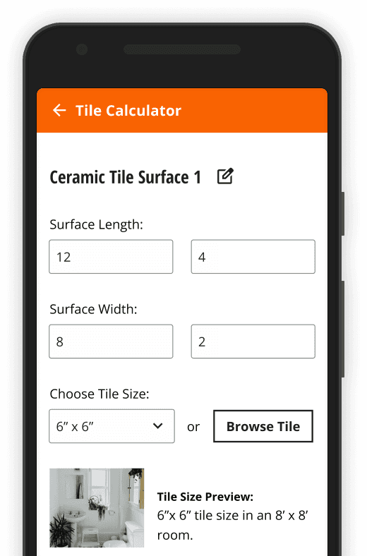

We wanted to improve the project calculators to enable users to create lists and purchase materials. We instead focused on improving visibility of a second calculator we found on the site.
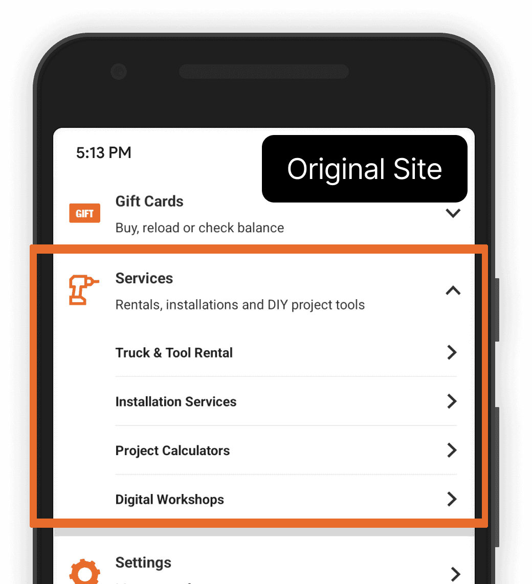
To bring the navigation more in line with the shopping experience users already knew, we categorized the project resources according to their placement in the shopping navigation.
For the DIY section, we focused on aligning the top-level categories to the stages of a DIY project- breaking it down into inspiration, research, and execution.

In a tree test of the new navigation, using the same tasks as the first test, we found a marked improvement in users' ability to find the same guides and resources.
Though there was still some room for improvement, we found that some imprecise wording in one of the tasks might have affected the results of that task.
3/4 users found the "Replacing Tile" guide.
3/4 users found the Project Calculator.
2/4 users found the recommended product in the Materials drawer.
1/4 user found the Expert Support chat feature.

Users didn't expect the materials list to be interactable and, as a result, many missed the ability to click in to see recommended products.

In the second iteration, I made the product listings immediately visible, but found that the width of the cards made the product names difficult to read and resulted in some inconsistent spacing.
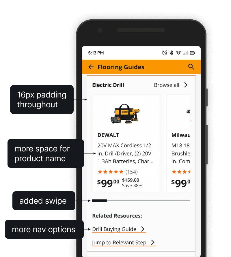
In the final iteration, I enabled users to swipe through product cards, which allowed them to be wider and more readable.
I also added additional navigation options, so users could jump to the step using the tool or learn more about them tools themselves.

Many users missed the Expert Support icon entirely due to its size and placement. Some users expected it to take them to customer support and some thought that it might apply to the Home Depot app as a whole.

I removed the icon from the top navigation and instead created CTA banners throughout the app to increase visibility of the feature and give users additional context as to where the button would take them.
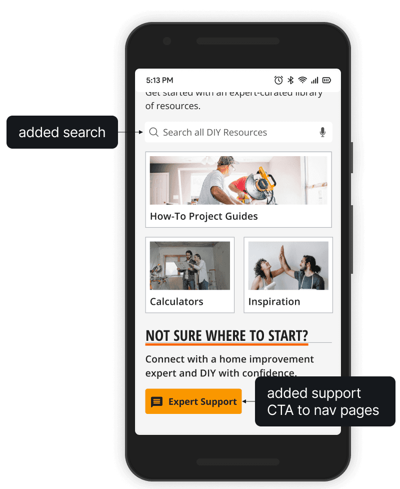
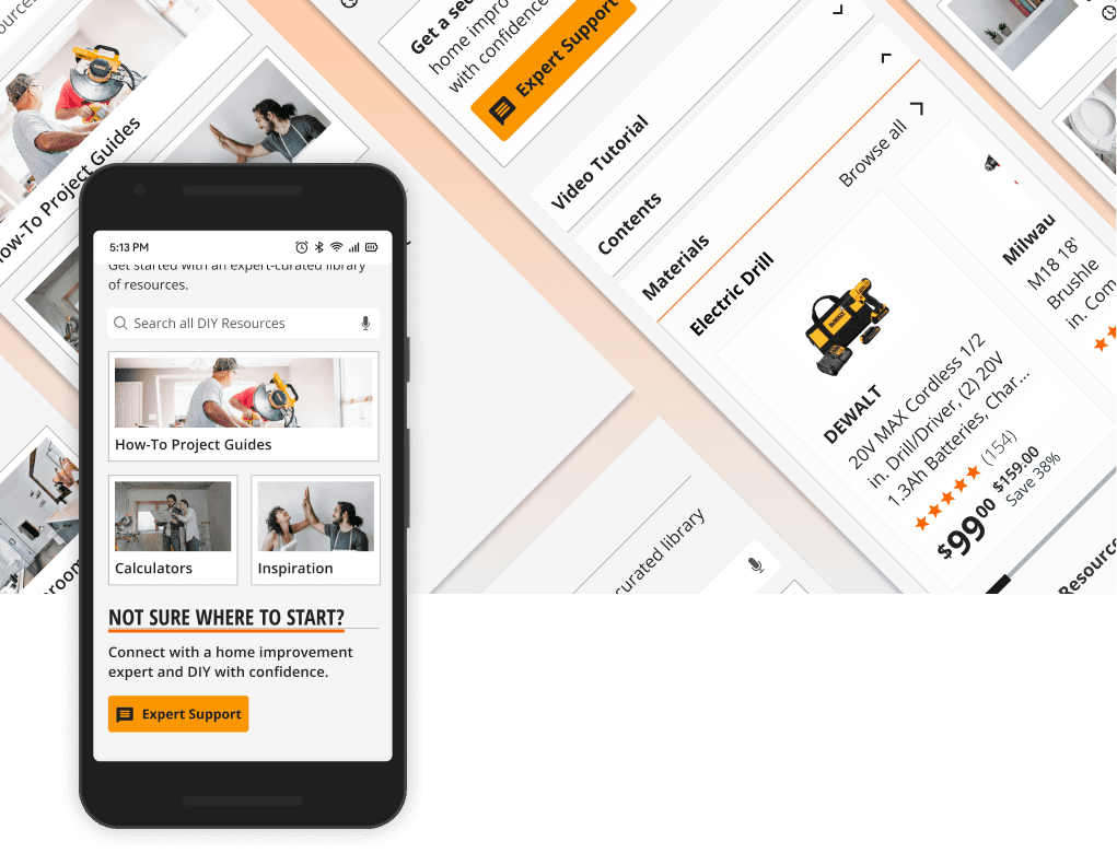
I added search to enable users to streamline navigation, especially when returning to a resource.
I also surfaced the Expert Support feature here, so users have easier access to help - especially if they're already in the middle of their project.
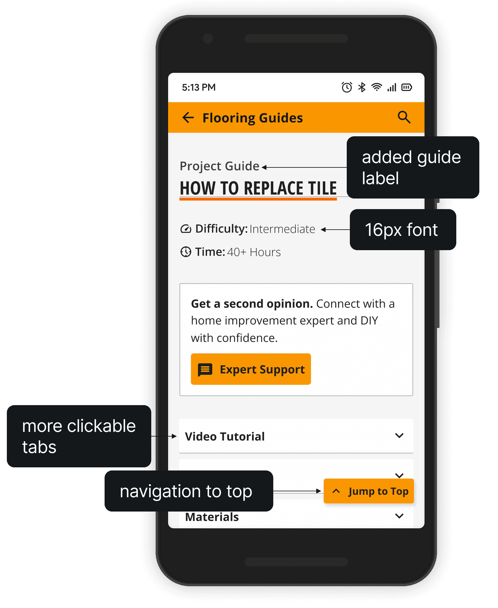
I added guide labels to help users quickly reference where they are on the site.
I adjusted the navigation tab size to give them a larger interaction area.
Finally, I added a floating "Jump to Top" button that appears once the user scrolls past the navigation menu.

Home Depot's current app has fonts as small as 8px with color contrast ratios as low as 3:1 throughout.
I wanted to showcase the trust that Home Depot's brand name brings while focusing on the readability and accessibility of Home Depot's content. I wanted to make sure the research users did on the Home Depot app was the most effortless and joyful part of their project.
Improving the contrast ratio of Home Depot's brand orange by lightening the orange when used on text, but maintaining that bright orange for accents - like the stroke under the project title.
Giving the icons throughout a more consistent weight and style, making them more instantly recognizable as part of Home Depot's brand.
Giving elements more consistent spacing within and throughout, to improve readability and make the pages more scannable for first-time users.


Help users ensure they're buying the right tools.
In our research, we found that 3/5 users feared buying the wrong tools or intentionally bought the same tools as were used in their resources.
I'd like to better facilitate the process through which users research their project, then buy materials, then execute their projects to ensure that they get the right materials and tools for the job the first time they go to the store.
Enable users to pick up right where they left off.
4/5 of our users said that they often had to walk away from a project and return to it later, making the ability to re-find those resources critical to their comfort with the project itself.
With more time, I'd like to explore better customizability for guides, lists, and calculators, enabling users to easily return to their projects and pick up where they left off, or scale their projects in the future.