Case Study

Fiber artists love the thrill of searching in-person for the perfect material for their next project, but the experience of shopping online often forces them to settle or make a return trip to the store.
I emulated the physical experience of holding two yarn labels up to each other so that fiber artists can purchase with confidence, even when they can't make it to their favorite yarn store.
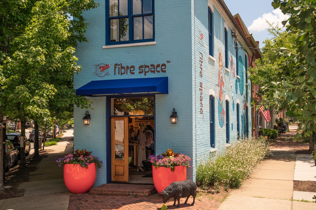
fibre space™ is a community yarn store based in Alexandria, Virginia. Their community is passionate about hand-dyed wool yarn, but lacks the confidence to buy online when they can't make it into the store.
If fibre space™ can improve the online experience for their customers, they have the opportunity to increase their yarn sales significantly.
Yarn shopping is an adventure
Their preferred yarn stores were dictated by vibes, not convenience.
I usually have a project in mind
While they sometimes impulse-shopped, they were usually buying for a specific project.
I consider myself a savvy shopper
Especially when shopping online, they wanted to know exactly what they were buying.
What does the community talk about?
By searching through and participating in online yarn-centered communities on Reddit, I found that most users cited the information provided about each yarn and the inability to compare options easily as their biggest frustrations.
How do artists categorize yarns?

Suzie
"I hate having to open 50 tabs just to figure out which yarn will work for my project."
Fiber artists are passionate about their craft and my persona, Suzie, represents the good and the bad of their typical experience. For an upcoming project, she needs to find a washable, worsted weight yarn in big enough skeins for a project she can make on the go.
She hates opening multiple tabs and flipping between them to compare her options and more than once she's bought yarn online, waited for it to arrive and then found that it didn't meet her expectations - sending her back to the store.
"I should've just gone to the store."
Suzie's current online shopping experience is an exercise in patience. She often has to sacrifice the quality of locally-sourced yarn stores for the convenience of big retailers and, even then, she's not guaranteed to find or to receive what she's looking for.


Suzie sees a pattern and is excited to start a new project, she already has an idea of what she'd like it to look like.

Assessing the options
She filters yarn by the weight the pattern requires and opens a tab for each skein she’s interested in (12+). She then closes them as she rules them out due to fiber content, color, or care instructions.

Finally, she finds the skein she’s most interested in. She places the order and waits 4+ days for it to arrive.

When her yarn arrives, she finds that it doesn't match her expectations and isn't going to work for this project.
She gives up and goes into the store to find a replacement.
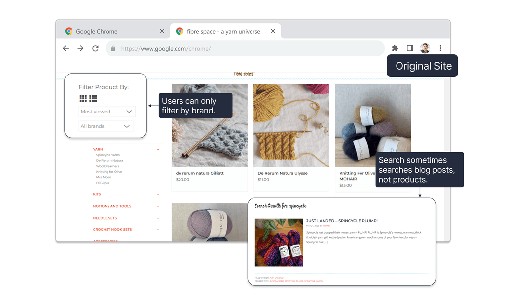
Filters didn't represent how users searched. Currently, users can only filter by brand.
The search feature was inconsistent - from some pages it would search products, but from others it searched blog posts.

In the compare products feature, the fields listed did not represent properties users said they cared about.
Most products were not set up to properly display properties in the compare feature, making most of the fields blank.
Users were left with only a description to compare products, which may or may not contain the properties they cared about.

Throughout the site, highly stylized fonts were used that could be hard to read.
There were contrast issues on the site that resulted in buttons that were difficult to read or information, such as in the footer, that users may not be able to see.

Every competitor had the ability to filter by weight and fiber content. Most prioritized weight and color over all else.

Looking at the product listings themselves, most product cards gave a non-standard name that might include brand, texture, weight, or fiber content. The most information users could reliably find from the search page was often fiber content, but the names are not descriptive.

Often mentioned online, Knit Pick's comparison tool only compares colorways within the same product line. While better than other sites, it doesn't solve the user's biggest problems.

Amazon enables users to compare very similar products with pre-set fields that are highly relevant to the product.
For shoes, it might be US women's sizes, or for keyboards it might be profile or switch type.

Capterra compares solutions to similar problems, using non-standardized information to help users make the best decision by thinking about their own situation and requirements for the solution they're looking for.

To bring fibre space's site in-line with most of the major yarn and craft retailers, I added the ability to filter by brand, weight, and fiber content.

Inspired by popular "Compare" design patterns, I added a sticky bar that allows users to add yarns to their compare list as they're browsing, eliminating the need to open multiple tabs and swap between them.

On the compare page, I sought to align the properties that could easily be standardized, while providing room for the existing descriptions that seem universal across most yarn sites, prioritizing the ones I found users mentioned the most.
0/3 participants used the weight filter when searching for a yarn of a specific weight.
1/3 participants found the yarn weight in the product card on the product listing page.

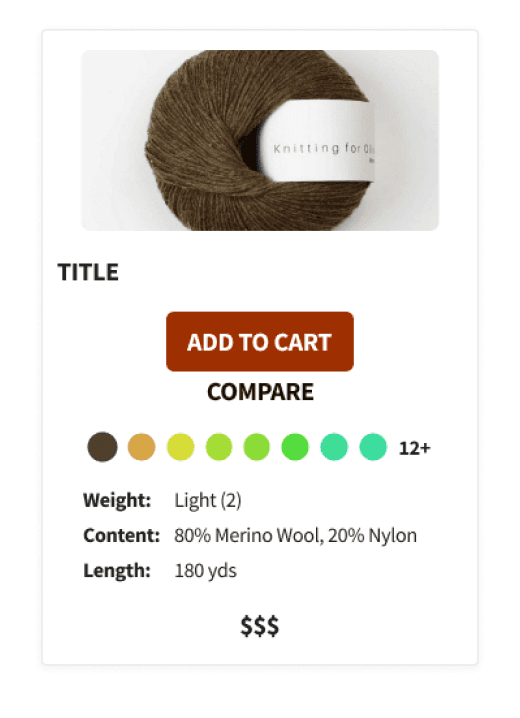
Because yarn weight was the most important category for most users, I added the option to select font weight up front from both the homepage and the "All Yarn" page. I also added a "By Yarn Weight" and "By Color" option to the "Shop" dropdown menu.
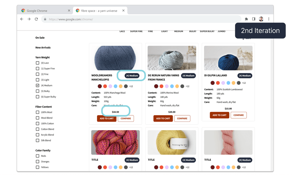
Because users often missed the yarn weight, I moved the price to the bottom of the card to make room for a more prominent yarn weight chip.
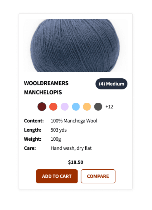
In my second iteration of the product card, I focused on making the yarn weight more visible, especially for new fiber artists.
In the third iteration, I implemented a growing product card that revealed more information on hover - but retired it due to accessibility issues.

In the final iteration, I returned to basics and focused on bringing font sizes up to improve readability, creating a card that could be consistent and accessible across the site.

Consistency was quickly becoming an issue as individual components evolved across iterations. In my final design iteration, I customized and implemented the Untitled UI Design System to ensure accessibility and consistency even as the site continued to grow.
