Case Study

When our team needed a better way to verify reporting data, I was challenged to come up with a transition plan that bridged their outdated system and introduced just enough friction to encourage users to resolve issues on their own while still being streamlined and intuitive.
I designed a portal that empowered our users to verify and correct their data, and saved our internal stakeholders hundreds of hours - all in a tight, two-week deadline and earning rave reviews from both internal stakeholders and the program's leadership.
We had a good idea of what needed to be accomplished: users needed a way to upload reports, see what data fields did not match our records, and either reupload the report with the correct data or report the discrepancy to our internal users to request a correction. We just didn't really know what that would look like.
Our primary goal was to eliminate manual work for our internal stakeholders by creating an automated, easy-to-use process that encouraged reporters to do as much as they could on their own before requesting corrections.

This project was being reprioritized after more than a year on the shelf. A set of mockups had been completed, but were created by contractors with little context and almost no facetime with stakeholders or users.
Before starting my own discovery with stakeholders, I identified issues with the existing designs that I would make my priority to tackle.

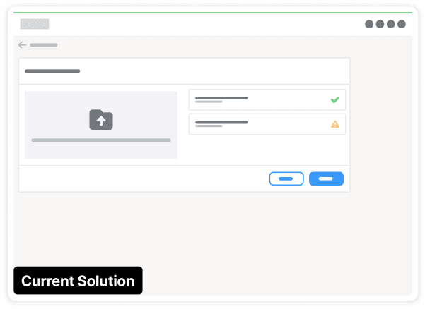
Users expected data to go from high level (user-level data) to low level (field-level data) as they moved from left to right on the screen. As a result, they were often confused as to what the tracker (teal box on the left) and comment field (purple box on the right) were referring to — the report (1.1), the property (1.1.2), or the field (1.1.2.1)?

Of 6 steps in the tracker, only two were relevant to the process users were currently doing. The rest of the steps would never be resolved in this system and because the tracker didn't appear anywhere else in the system, users would never see it completed.

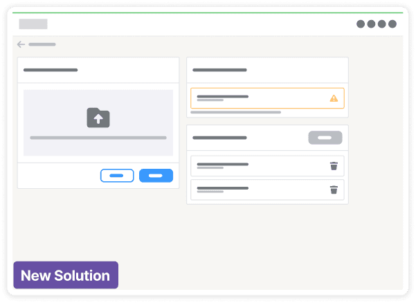
Users were required to submit a file and comment for evidence when they requested changes to a field in our database. In many instances, these changes were often caused by formatting differences - meaning that users could be writing the same comment and uploading the same file for hundreds of fields.
Inconsistent, unclear error handling: "What do I do now?"
The file upload process was the same across all reporting processes in the system, so users would often interact with it multiple times per month - but the process could be a lot better.

Step 1 - User adds files to the upload queue below the upload area and clicks upload.
There is no indicator to distinguish files that have already been uploaded from the ones they are selecting to upload now.

Step 2 - If the file cannot be read, a modal opens with the list of files with errors.
The user must remember which files didn't upload, as they won't be able to see the error again.
Step 3 - Any remaining files are shown to the right of the upload area with any remaining errors.
The user then has to individually delete each file with errors and reupload it.

Using empty states to set user expectations.
In the new design, files move through a series of cards - upload, validate, and success. When all files are in the final card the "Next" button becomes enabled.
I created a clear journey files move through so the user can quickly see what needs work.
Consistent error handling, so users don't have to memorize.
Users only wanted to know which errors hadn't gone through and what they needed to do about it.
By moving all of the errors to one place and eliminating the modal, the system no longer required users to try and remember which files they needed to check.
6/8 stakeholders said the most important thing was encouraging reporters to solve variances on their own (instead of reporting them).
4/8 stakeholders said the platform must be intuitive and easy to use, as reporters often changed month-by-month.
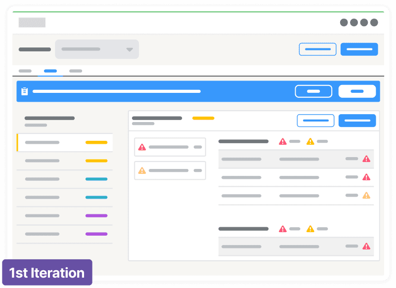
Iteration 1: A separate reporting mode
Users would manually enter a reporting mode where they would individually select, justify, and submit errors to report.
This resulted in too much repetition - as the same issue might cause hundreds of errors that would have to be reported individually.

Iteration 2: Report all remaining
When clicking "Report", a modal would require users to check a box confirming that they had resolved all errors they possibly could.
We found that this amount of friction was just enough to keep them from submitting unnecessary errors.
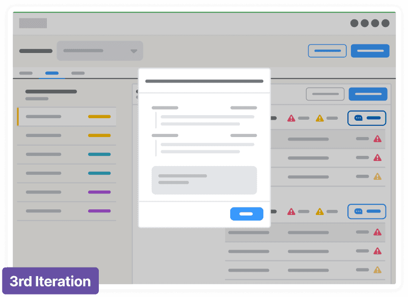
Iteration 3: Adding comments & justification
The previous iterations had completely removed the process of justifying errors reported, when we brought it back we separated it from submitting the report, so we could create a historical record of reported errors and decisions without slowing users down.
Daily Standups
The product team met daily to go over design updates and to sync on any technical limitations.
Stakeholder Updates
Regular stakeholder check-ins ensured that any problems were highlighted and addressed early.
Early Dev Involvement
I sought feedback as early as possible to ensure we were on the same page before hand-off.
"Fumiko owns every solution she works on from start to finish. She knows when to include which partners, at which time in the process, and when to push back in support of good UX design, customer expectations, and sustainability."
- Creative Director
"Within 2-3 weeks of joining us, Fumiko picked up on the complex project details and delivered phenomenal screens that not only meet the business requirements but are also very user-friendly and intuitive."
- Product Owner