Case Study

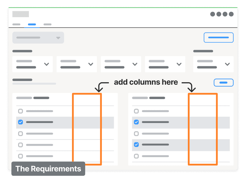
When asked to expand the functionality of an internal team's accounting platform, we thought it would be as simple as adding columns to a table, but discovery uncovered missing requirements that would have created data architecture that was not scalable.
By digging into the business process and bringing all of the stakeholders to the table, I was able to design a solution that scaled across the entire business, eliminated hundreds of hours of manual process, and created visibility for millions of dollars moving through the system on a daily basis.
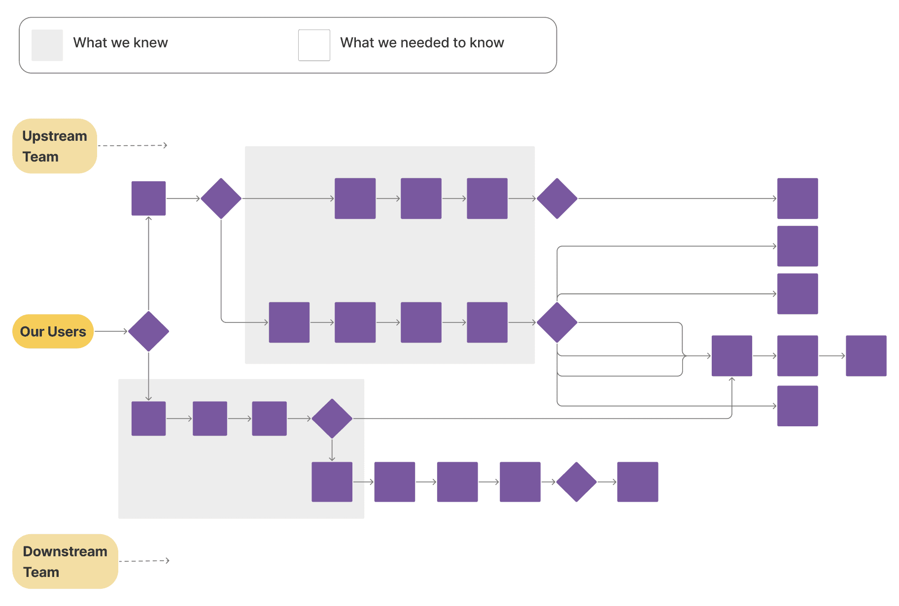
We weren't accounting for the whole process.
We were missing a lot of data on the upstream and downstream workflows, and we were building to accommodate the data, not the users.
Users weren't on board with the future state.
Our vision for the platform didn't match the users' or their current needs. We needed better alignment before we built anything else.
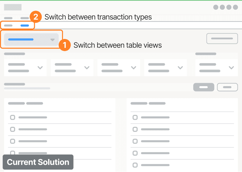
Our solution wasn't going to scale.
We had boxed ourselves in on the navigation. When it came time to add other transaction types to the system, we would find ourselves here again.
We're giving our users whiplash.
Our users are matching dozens of transactions per day. When I mapped out the process for each transaction, it was easy to see where time was being wasted.
Users had to search for information that wasn't displayed clearly, and would have to scroll through the page to access information that they always needed in a particular order.

User checks the unallocated total to estimate their workload for the day.

User identifies the first transaction to match.

User scans the second table to find a likely matching expected record.
User checks the total amount received.

User checks the total amount expected to ensure that the two numbers match.

User clicks submit to confirm the allocation.

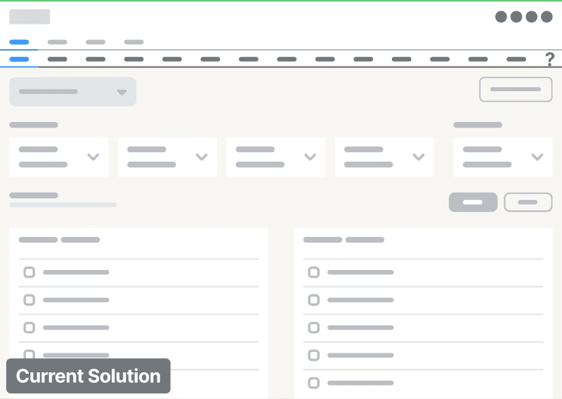
The current solution doesn't scale.

In the updated navigation, we moved all functions of the process we were tackling out of the global navigation and created something more streamlined.

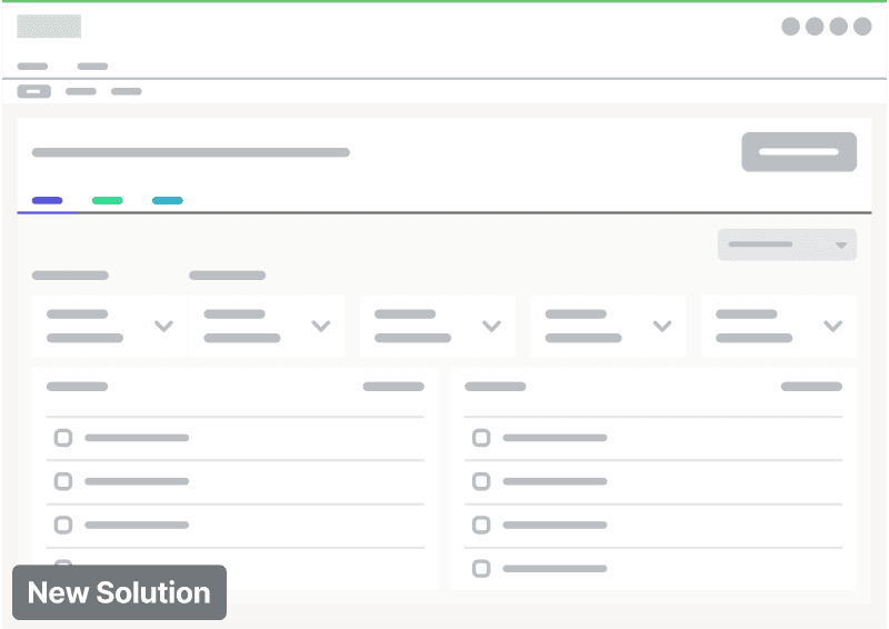
A more familiar nav pattern.
By moving the table views to a nav bar, we created more visibility for the users' options and brought the navigation in line with other parts of the platform.

Simpler and scalable.
By putting all of the transaction types on one page and enabling users to filter via a dropdown, I simplified the data architecture and created more flexibility as transaction types are added.
Retired hours of monthly and daily manual process, eliminated two layers of manual approval, and created a shared portal that enables downstream teams to see when payments have come in without having to pick up the phone or wait for an email response.
"Fumiko has been so easy to work with and responsive. I appreciate her diligence and attention to detail."
- Product Owner